You are using an out of date browser. It may not display this or other websites correctly.
You should upgrade or use an alternative browser.
You should upgrade or use an alternative browser.
New Forum Layout Is Live! Things to know
- Thread starter Mike Greene
- Start date
- Status
- Not open for further replies.
creativeforge
the plumber
Thankfully, there is a way to turn off dark mode, in the upper right corner.
Some of us who have visual impairment and need high-contrast to read things without getting super-stressed within a half second of viewing. While it's true that the initial look was overly-bright, I can handle that better any day than what happens to my eyes when there's an ultra-dark theme in place. It throws me back to the early 80's, before we were finally able to start implementing black-on-white for greater clarity on the old white-on-black-only "dumb terminals" that came before desktop computers were around yet.
At any rate, having found the on/off switch for dark-vs.-light mode, I am pretty sure the new "light mode" is also superior to the initial look of the new layout, but I don't have screenshots to prove it.
I certainly cannot fully understand your reality, thanks for letting us know. If you notice something else that could be useful for our members that are visually impaired.
Regards,
Andre
storyteller
Senior Member
Been loving the dark theme too, but the new ffaded backgrounds looks like a pair of blue jeans on my screen. All are very artifacted. 5k iMac. Just a heads up.
creativeforge
the plumber
Been loving the dark theme too, but the new ffaded backgrounds looks like a pair of blue jeans on my screen. All are very artifacted. 5k iMac. Just a heads up.
You can pick a different one by clicking the little "switch" beside your account avatar on the top of the page. Look between the bell and the light bulb.
Kenneth Young
New Member
Hi Kenneth, can you try it now?
Yip - sorted. Cheers!
Pixelpoet1985
Senior Member
First: I like the new layout!
But: It would be nice if the thread title (and also the breadcrumbs and pagination) is sticky. I have several tabs opened all the time and quickly lose track. Just my 2 cents.
But: It would be nice if the thread title (and also the breadcrumbs and pagination) is sticky. I have several tabs opened all the time and quickly lose track. Just my 2 cents.
creativeforge
the plumber
First: I like the new layout!
But: It would be nice if the thread title (and also the breadcrumbs and pagination) is sticky. I have several tabs opened all the time and quickly lose track. Just my 2 cents.
It could be discussed... What are you using, desktop? Tablet?
Pixelpoet1985
Senior Member
Usually desktop.It could be discussed... What are you using, desktop? Tablet?
d.healey
This is a custom title
creativeforge
the plumber
Hi,I usually start my day with my morning coffee and a host of websites that I scan for news etc. These include the post, the times, and other blogs Etc. I don't have this problem anywhere else. The font at vi-control is abnormally small.
I myself often have to increase fonts but on EVERY site, though.
Are you looking at the site on a mobile phone? Tablet? Desktop?
Dark or Light theme? Which browser?
Did you adjust anything regarding the zoom setting?
Can the fonts be made larger? They possibly could. I thought 16px was big enough?

@Mike Greene ?
Andre
-------------------
VIC Tech support
-------------------
PaulieDC
Too much gear, not enough composing. Oy vey.
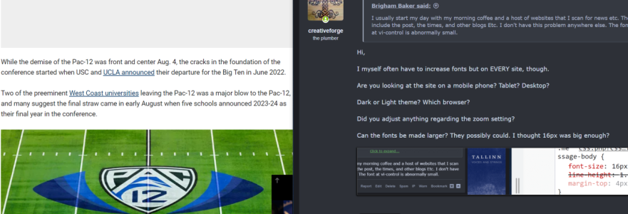
Not trying to be disrespectful to the question raised, but has anyone has made mention about this before? Here's a FoxNews sports article next to VI-C, and the news text is smaller:Hi,
I myself often have to increase fonts but on EVERY site, though.
Are you looking at the site on a mobile phone? Tablet? Desktop?
Dark or Light theme? Which browser?
Did you adjust anything regarding the zoom setting?
Can the fonts be made larger? They possibly could. I thought 16px was big enough?

@Mike Greene ?
Andre
-------------------
VIC Tech support
-------------------

I then looked at an Amazon review and that text is even smaller than Fox News.
Believe me, my wife and I get SO frustrated with not being able to read simple stuff like ingredients on a cereal box without reading glasses, lol, but I've never thought VI-C was too small. Is this a thing?
Call me overly suspicious, but this post doesn't pass the smell test.I usually start my day with my morning coffee and a host of websites that I scan for news etc. These include the post, the times, and other blogs Etc. I don't have this problem anywhere else. The font at vi-control is abnormally small.
Brigham, if you truly are a legit person, realize that 45 minutes after joining the site is a little soon to be offering critiques, especially when it involves resurrecting 4 year old threads. After you've been on the forum a year or so, then would be the time to offer helpful suggestions.
I’m going to lock the thread so people won’t get confused and think there's a new forum update, if they don’t notice this is a 4 year old thread.
- Status
- Not open for further replies.
Share:


