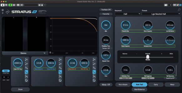
Here's my problem with those two:People get put off stratus & symphony by the GUI, but they're excellent reverbs created by Michael Carnes, maybe dig into those a bit more before adding more stuff to the plugin folder.
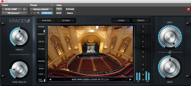
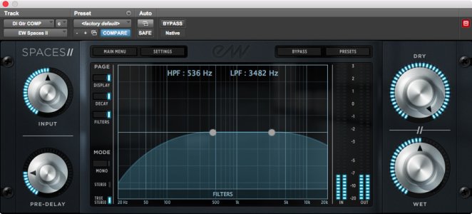
Tiny hard to read font that is much smaller than all the other text in the GUI (I added green rectangles to highlight them, those are not part of the GUI):
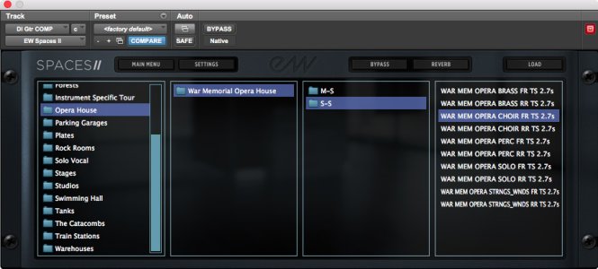
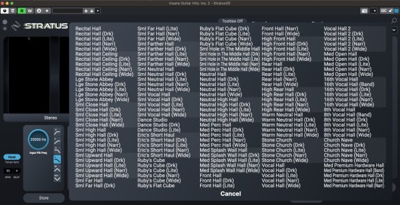
And this is just a horrible mess. Too many presets on screen with little space between them, so they're hard to read even with larger font.
Any software, plugin or not, has to have a clear interface, and preferably one that is nice to look at.
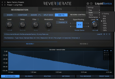
For example, look at the Liquid Sonic plugins (thanks Trash Panda for the tip). Those are beautiful GUIs. Not that I'm going to spend a lot of money just because of a nice GUI, but it helps when considering among several choices of something that I'll probably use a lot.
And what's the difference between Stratus and Symphony?


 so butt ugly.